Check your site's tablet and laptop layouts from your phone
Phone browsers only offer Request Desktop Website, which swaps the user agent but never the width. Ion's device picker lays a page out at an iPad or laptop's actual pixel width and scales it to fit your screen.
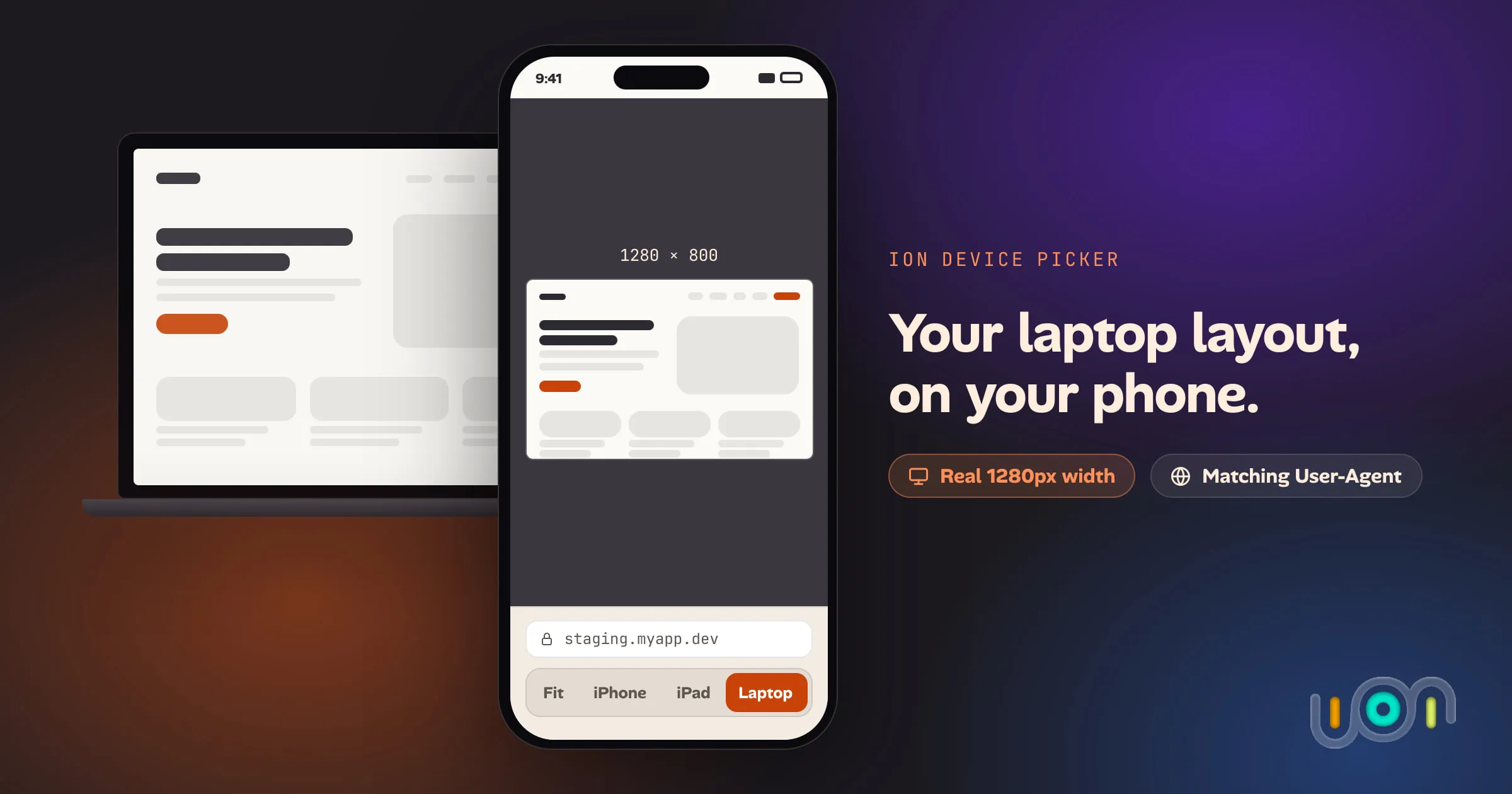
A teammate shipped a fix on a call and asked me to check the tablet layout before he merged. I was on my phone, nowhere near a laptop. Request Desktop Website was the only option Safari gave me, and it didn’t answer the question — it just made the page think it was talking to a Mac.
What “desktop site” doesn’t do
Request Desktop Website
(Safari) and Desktop site (Chrome, Firefox) change one thing: the User-Agent string the browser sends. It’s the
only user agent switch Safari, Chrome and Firefox on iPhone have.
Sites that serve different markup to desktop browsers, or redirect phones to an
m. subdomain, will notice and react.
Almost nothing else does, because a responsive site doesn’t decide its layout from the User-Agent. It decides from the CSS viewport width, and the viewport on your phone is still about 390 pixels wide — the toggle doesn’t touch it. Ask for the desktop site and you usually just get the same mobile layout with a different user agent attached. There’s no way to say “834 pixels, like an iPad” or “1280, like a small laptop,” and nothing to pan around once you’re there.
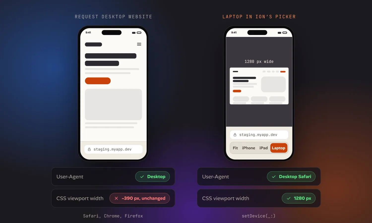
The device picker in Ion
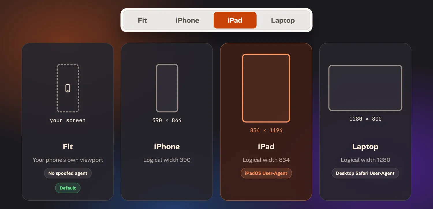
Ion’s toolbar has a device picker with four options: Fit, iPhone, iPad
and Laptop. Choosing one does two things at once — it’s the same
setDevice(_:) call that drives both parts:
- The page is laid out at that device’s logical width — 1280×800 for Laptop, 834×1194 for iPad, 390×844 for iPhone — then scaled to fit your screen, and you can pan and zoom it like a photo.
- The User-Agent switches to match: a real desktop Safari string for Laptop, an iPadOS string for iPad. So a site that branches on User-Agent and one that branches on viewport width both see what they’d see on that actual device.
Fit is the default: no spoofed width, no spoofed agent, just your phone’s own viewport. Switching to Laptop is closer to plugging your phone into an external 1280px monitor than to ticking a “desktop” checkbox.
Each project remembers its own choice. If you’re mostly checking the tablet breakpoint on one project, set it to iPad once and every time you open that project you’re already there — no picker, no reselecting after every reload.
What it isn’t
This isn’t a replacement for Chrome’s Device Mode or Safari’s Responsive Design Mode when you’re actually at a desk — those have CPU and network throttling, custom sizes down to the pixel, and Safari’s Open with Simulator runs real WebKit in a real simulator. Ion’s picker is for the gap those tools can’t reach: checking a layout when the only screen in the room is the one in your hand.