Responsive design mode in Chrome, Safari and Firefox, and what to use on a phone
Chrome, Safari and Firefox each have a responsive design mode that lays out a page at any width. Here is how each one opens and what it offers, and what you can actually use when the only screen you have is a phone.
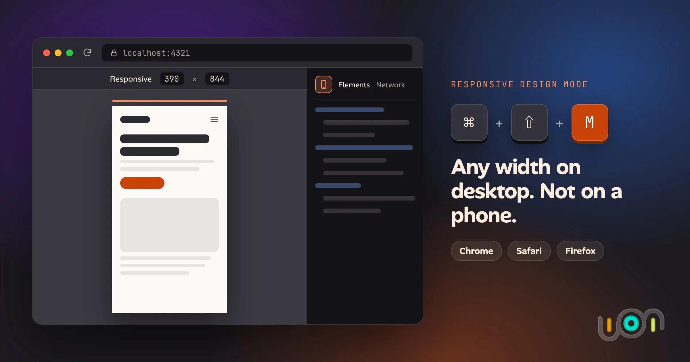
Every desktop browser can pretend to be a phone. Open the responsive design mode, pick a width, and the page lays out as if the window were 390 pixels wide. It’s one of the most-used tools in front-end work, and all three major browsers do it well.
Try it the other way round and you’re stuck. A phone browser can’t pretend to be a laptop or a tablet, at least not in any way you can control. This post compares the three desktop tools and then covers what’s left when your phone is the only screen you have.
The short answer
| Browser | Platform | Open it with | What you get | Catch |
|---|---|---|---|---|
| Chrome (and Edge) | Desktop | ⌘⇧M on Mac or Ctrl+Shift+M on Windows/Linux, with DevTools open | Device presets, custom sizes, a width ruler, DPR, touch, user agent, throttling | Desktop simulating a phone, never the reverse |
| Safari | macOS | Develop → Enter Responsive Design Mode (⌃⌘R) | Drag-to-resize viewport, 1x/2x/3x pixel ratio, Open with Simulator | Needs the Develop menu turned on. No device presets since Safari 17 |
| Firefox | Desktop | ⌥⌘M on Mac or Ctrl+Shift+M on Windows/Linux | Device list, custom sizes, DPR, touch simulation, network throttling | — |
| Safari, Chrome, Firefox | iPhone/Android | Request Desktop Website or Desktop site | A desktop user agent | You can’t pick a width, so there’s no tablet layout and nothing to inspect |
(Shortcuts and menu names are current as of September 2026. They do move between releases, so check them if you’re reading this much later.)
Chrome DevTools: Device Mode
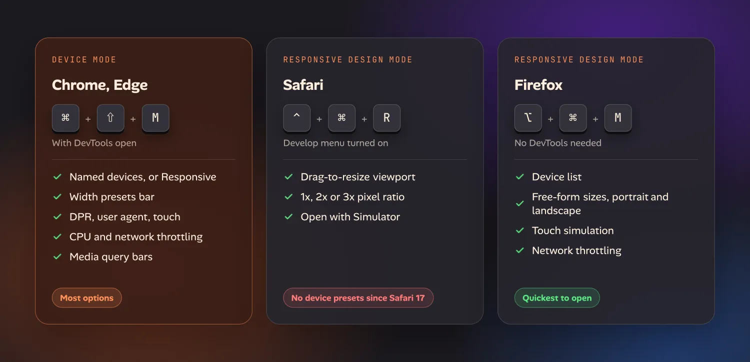
Open DevTools, then press ⌘⇧M (Mac) or Ctrl+Shift+M (Windows, Linux, ChromeOS). You can also click the Toggle device toolbar icon at the top left of DevTools. The shortcut only works while DevTools is open. Edge is built on the same engine and uses the same tool and shortcut.
Chrome’s version has the most options:
- Dimensions menu. Named devices, or Responsive for a free-form size you drag or type.
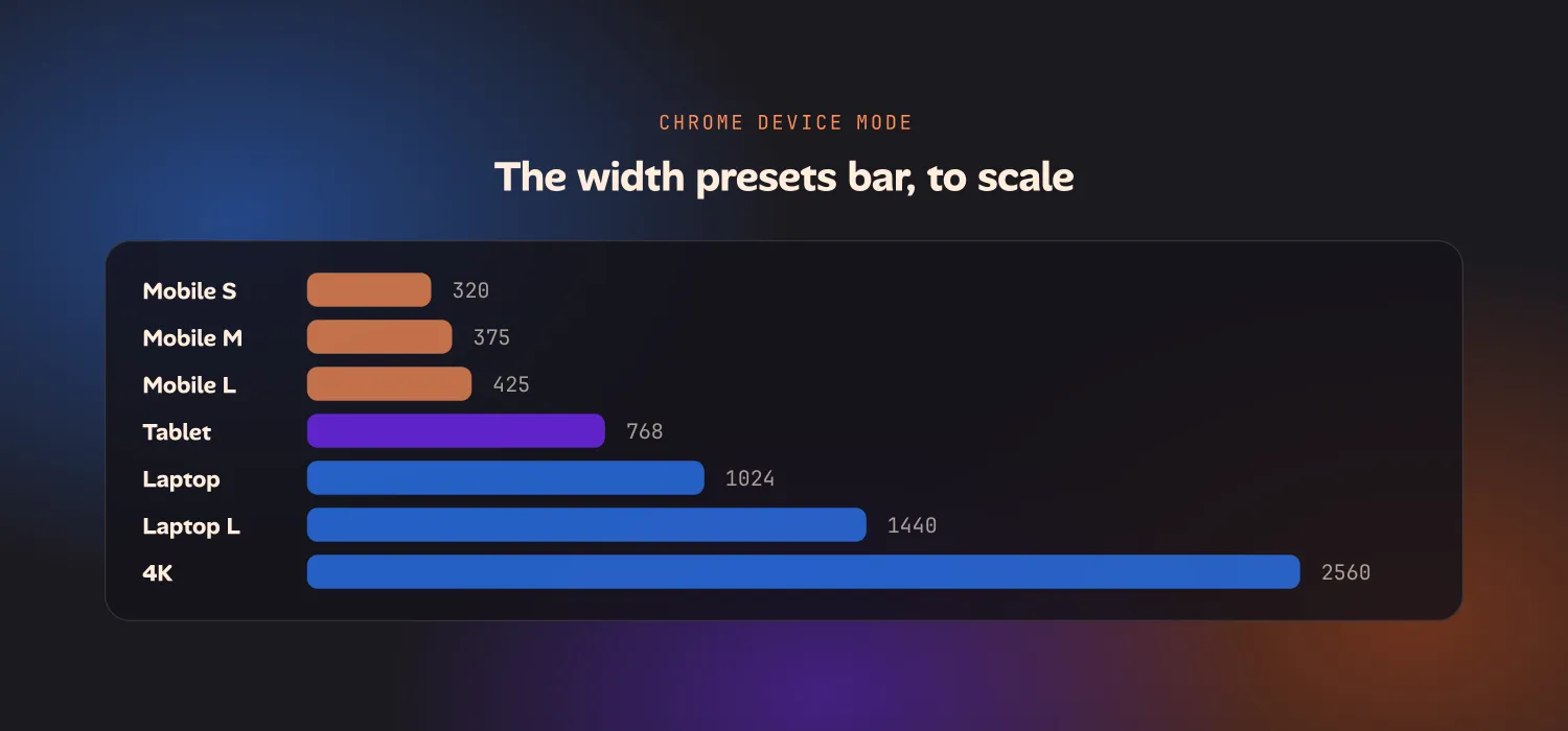
- Width presets bar. Click Mobile S (320), Mobile M (375), Mobile L (425), Tablet (768), Laptop (1024), Laptop L (1440) or 4K (2560) to jump to that width.
- Device pixel ratio, user agent and touch events. These change with the device you pick, and you can set them by hand.
- CPU and network throttling. Both are in the same toolbar.
- Media query bars. These show where your breakpoints fall.
Google’s documentation is blunt about the limits: there are “aspects of mobile devices that DevTools will never be able to simulate”, starting with the mobile CPU. For accurate results, Google points you to remote debugging on a real device.
Safari: Responsive Design Mode
First turn on the Develop menu: Safari → Settings → Advanced → Show features for web developers. Then choose Develop → Enter Responsive Design Mode, or press ⌃⌘R.
Safari 17 cut the tool back on purpose. The row of iPhone and iPad presets is gone. You get a viewport you resize by dragging its edges, a readout of the current size, and a menu for 1x, 2x or 3x pixel ratio. WebKit’s reasoning was that sites should respond to any width, not a list of named devices. That’s a fair point, but it makes “show me an iPad” a manual job.
What Safari has that the others don’t is Open with Simulator. It opens the current page in an Xcode iOS Simulator, which runs real iOS Safari instead of an imitation. The catch is that you need Xcode installed. To change the user agent, use the separate Develop → User Agent menu. It applies to the current tab only.
Firefox: Responsive Design Mode
Press ⌥⌘M (Mac) or Ctrl+Shift+M (Windows, Linux), or choose Browser Tools → Responsive Design Mode from the menu. DevTools doesn’t need to be open.
Firefox sits between the other two. You get a device list that sets screen size, pixel ratio and user agent together. You also get free-form resizing, portrait and landscape, a touch simulation toggle that turns mouse drags into touch events, and network throttling from GPRS up to Wi-Fi. Mozilla notes the throttling is only a rough guide, and the same goes for every tool here.
Which desktop tool to use
All three are good, and the differences are small.
- Chrome has the most control in one toolbar: presets, throttling and breakpoint bars. It’s the default for most people.
- Safari is the one to use when the question is “what will iOS do?”, because Open with Simulator gets you real WebKit on a simulated iPhone.
- Firefox is the quickest to open (no DevTools needed) and checks your layout in a third engine.
For checking several widths at once, Polypane and Responsively App show a row of viewports side by side, with scrolling kept in sync. When an emulator isn’t good enough, BrowserStack and LambdaTest stream real devices from the cloud.
What to use on a phone
This is where the comparison falls apart. Phone browsers don’t have a responsive design mode. What they have is a desktop-site toggle:
| Browser | Platform | Where | What it does |
|---|---|---|---|
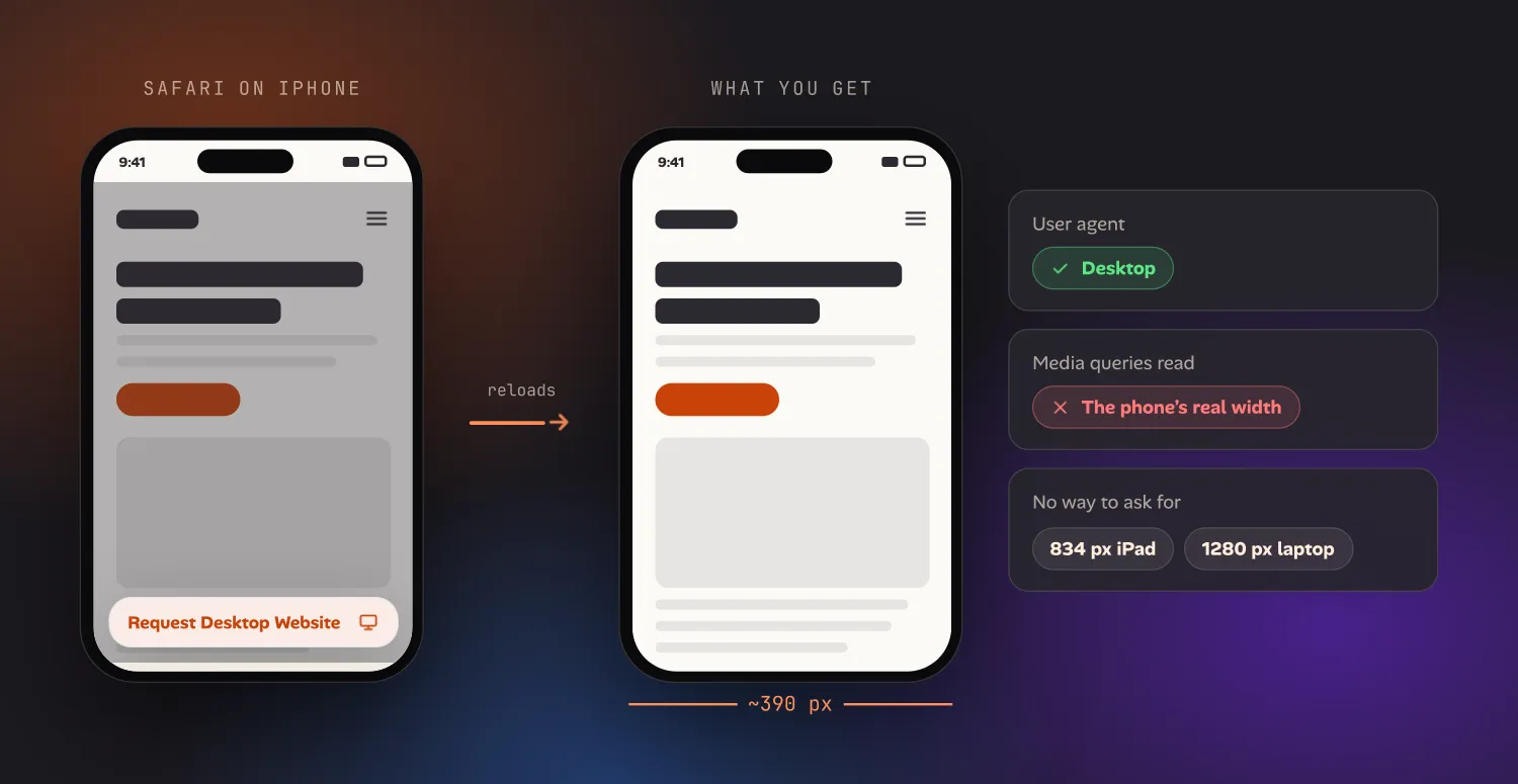
| Safari | iPhone, iPad | Page menu next to the address bar → Request Desktop Website | Sends a desktop user agent and reloads |
| Chrome | iPhone | ⋯ menu → Request Desktop Site | Sends a desktop user agent and reloads |
| Chrome | Android | ⋮ menu → Desktop site checkbox | Sends a desktop user agent and reloads |
| Firefox | Android | ⋮ menu → Desktop site toggle | Sends a desktop user agent and reloads |
The toggle changes who the site thinks you are, and only to the browser’s own desktop identity: picking any other user agent on an iPhone takes an extension, a different browser or a Mac. It doesn’t change how wide the page is. If a site sends different markup to desktop browsers, you’ll see that. But a responsive site decides its layout with CSS media queries, and those still read the phone’s real width of about 390 pixels. On most modern sites, Request Desktop Website gives you the mobile layout with a different user agent. There’s no way to ask for 834 pixels (an iPad in portrait) or 1280 pixels (a small laptop), and no way to inspect the result.
Here’s what’s left when you’re away from a desk:
- Remote debugging from a computer. You can connect an iPhone to Safari Web
Inspector on a Mac, or an Android phone to
chrome://inspect. This is the most accurate option, but it needs the computer, which defeats the point. - A cloud device in the phone’s browser. BrowserStack and LambdaTest work in a mobile browser, but they’re paid and laggy on a phone. You’re also streaming a laptop-sized screen onto a phone-sized one.
- Rotating to landscape. This gives you a few hundred extra pixels, which is sometimes enough to cross a breakpoint and often isn’t.
- An iPad. It’s the easiest way to see a tablet layout without an emulator, if you have one nearby.
So the honest answer is that there’s no phone equivalent of responsive design mode. The desktop tools are excellent. The phone tools only change the user agent and nothing else.
Laying out a laptop-width page on the phone itself
That gap is why we built a device picker into Ion, our in-progress iPhone browser and workspace for testing the sites and apps you build. Pick Laptop and the page lays out at 1280 × 800, and at 834 × 1194 for iPad, 390 × 844 for iPhone, or Fit to use the phone’s own width. The page is scaled down to fit the screen, and you can pan and zoom it. The user agent switches to match, and each project remembers which device it opens with. It’s the “what does the laptop layout look like?” check, from the couch.
It doesn’t replace Chrome’s throttling or Safari’s Simulator for serious testing, and it isn’t meant to. Ion hasn’t launched yet. If checking a breakpoint currently means going back to your desk, you can join the early-access list to hear when it does.
Frequently asked questions
What is the Chrome Device Mode shortcut?
Open DevTools first (⌘⌥I on Mac, F12 or Ctrl+Shift+I on Windows and Linux), then press ⌘⇧M on Mac or Ctrl+Shift+M elsewhere. Edge uses the same shortcut.
Is there a responsive design mode on mobile?
Not in Safari, Chrome or Firefox on iPhone or Android. They only offer a desktop-site toggle, which changes the user agent but not the layout width. To lay a page out at a tablet or laptop width on a phone, you need a separate app that renders the page at that width and scales it down.
How do I test a website at different screen sizes on my phone?
Rotating to landscape and using Request Desktop Website help a little, but neither lets you pick a width. The reliable options are remote debugging from a computer, a cloud device service, or an app built to render pages at a chosen width.
Why does “Request Desktop Website” still show the mobile layout?
Responsive sites choose their layout with CSS media queries, which read the viewport width, not the user agent. Your phone’s viewport is still about 390 pixels wide, so the mobile layout still applies.