How to view the desktop version of a site on iPhone and Android
Every major mobile browser can request a site's desktop version. Here is where the option lives in Safari, Chrome, Firefox, Edge and Samsung Internet, how to make it stick, and what it doesn't do.
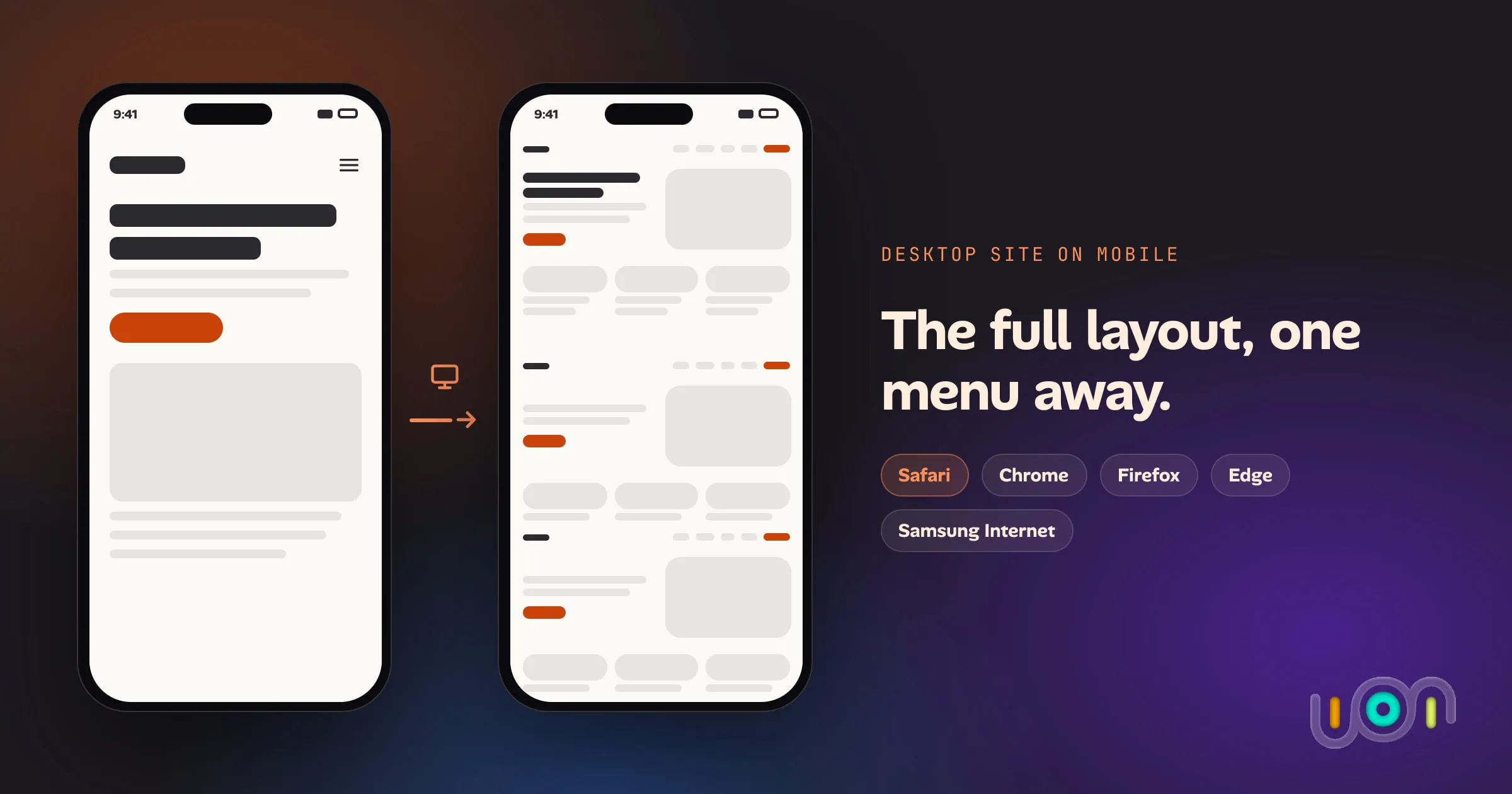
Every mainstream phone browser has a “desktop site” option, and it takes one or two taps. What’s harder is finding it, because each browser puts it somewhere different and Safari moved it in iOS 26. Making it permanent for one site is harder still.
Below is the option in each browser, then how to keep it switched on, and then the part most guides leave out: what “desktop site” actually changes, and why it isn’t the same as seeing the page on a laptop.
The short answer
| Browser | One page | Always, or for one site |
|---|---|---|
| Safari (iPhone, iOS 26) | Page menu button beside the address bar → ⋯ → Request Desktop Website | Settings → Apps → Safari → Request Desktop Website |
| Safari (iPhone, iOS 18 and earlier) | aA → Request Desktop Website | aA → Website Settings, or the Settings path above |
| Chrome (iPhone, iPad) | ⋯ → Request Desktop Site | ⋯ → Settings → Content Settings → Default Site View |
| Chrome (Android) | ⋮ → tick Desktop site | ⋮ → Settings → Site settings → Desktop site |
| Firefox (Android) | ⋮ → turn on Desktop site | Settings → Site settings → Request desktop view |
| Firefox (iPhone) | Menu → Request Desktop Site | Request it each time |
| Edge (Android) | ⋯ → Desktop site | Settings → General → Site display settings |
| Samsung Internet | Menu (≡) → Desktop site (Desktop version in older versions) | Varies by version |
Whichever you use, the page reloads. If the site still looks like its mobile version, skip to why it didn’t work.
Safari on iPhone
Safari’s desktop option is in the page menu, which Apple has moved more than once.
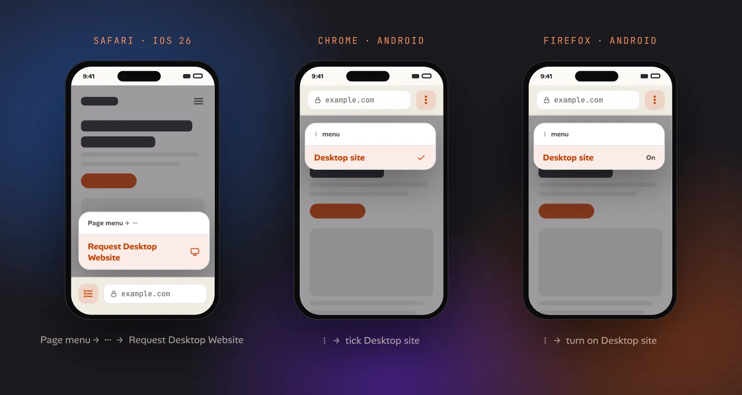
iOS 26. Tap the page menu button at the left of the address bar (it shows page settings, not tabs). In the panel that opens, tap ⋯, then Request Desktop Website under the page actions. The steps are the same whether you use the compact, bottom or top tab layout; only where the address bar sits changes.
iOS 15 to 18. Tap aA in the address bar, then Request Desktop Website.
To go back, open the same menu and tap Request Mobile Website.
Keep it for one site. Open the page menu (aA on older versions) and look for Website Settings, then turn on Request Desktop Website. Safari remembers it for that domain.
Keep it for every site. Go to Settings → Apps → Safari (Settings → Safari before iOS 18) and turn on Request Desktop Website under Settings for Websites. You can see and remove per-site choices from the same screen.
Chrome on iPhone and iPad
- Tap ⋯ at the bottom right (at the top right on iPad).
- Scroll the row of actions and tap Request Desktop Site.
To make it the default, tap ⋯ → Settings → Content Settings → Default Site View and choose Desktop. That applies to every site you visit.
Chrome on Android
- Tap ⋮ at the right of the address bar.
- Tick Desktop site.
Untick it to go back. Chrome on Android handles defaults better than most:
- For every site: ⋮ → Settings → Site settings → Desktop site. The default setting picks mobile or desktop based on your screen size and how much RAM the device has. Phones get mobile; tablets with 8 GB of RAM or more get desktop. Choose Desktop site to always request it.
- For one site: on the same screen, tap Add site exception and enter the domain.
Firefox on Android
Tap ⋮ and turn on the Desktop site switch. The page reloads in desktop mode, and the switch stays on for that tab.
To change the default, go to ⋮ → Settings → Site settings → Request desktop view. Firefox now requests desktop sites by default on larger tablets and foldables, so if you’re seeing desktop layouts you didn’t ask for, that’s the setting to switch off.
Firefox on iPhone
Tap the menu button and choose Request Desktop Site. I haven’t found a setting that makes it the default, so expect to request it each time.
Edge and Samsung Internet on Android
- Edge: tap ⋯ and choose Desktop site. To make it the default, go to Settings → General → Site display settings and choose Show desktop site as default.
- Samsung Internet: tap Menu (≡) and choose Desktop site, called Desktop version in older releases. The page reloads straight away.
What “desktop site” actually changes
Most guides stop at the menu. For anyone checking how their own site looks, the details matter.
Turning the option on does two things.
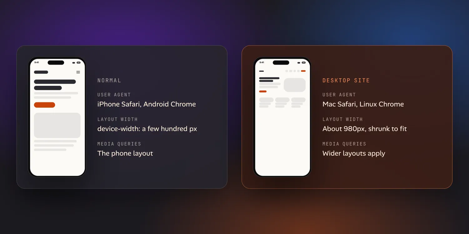
It changes the user agent. The browser tells the server it’s a desktop
browser. Chrome on Android reports itself as Chrome on Linux, and Safari on
iPhone reports itself as Safari on a Mac. A site that sends a separate mobile
version, or redirects phones to an m. subdomain, will now send the desktop one.
Sending any string other than the browser’s own desktop one takes more work; see
can you change the user agent on iPhone? On a
computer it’s easier: every desktop browser can
send a custom user agent
from its developer tools.
It widens the layout. Normally a responsive site tells the browser to lay the
page out at the phone’s width (width=device-width, a few hundred CSS pixels).
In desktop mode, the browser ignores that and lays the page out wider, then shrinks
it to fit. Chrome on Android uses a fixed 980-pixel layout width. Safari on
iPhone does something similar. Because the layout is wider, CSS media queries
for wider screens now apply, and you’ll usually see the site’s tablet or narrow
desktop layout.
What it doesn’t let you do:
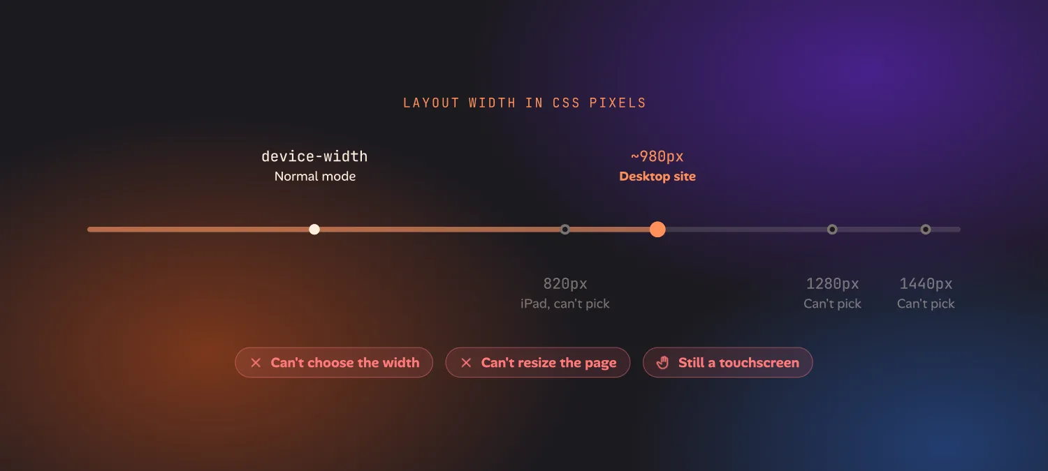
- Choose the width. You get one fixed width, roughly 980px. You can’t ask for 1280px, 1440px, or an iPad’s 820px, so the layout you see may not be the one a laptop user sees.
- Resize the page. Nothing reacts the way it would if you dragged a desktop window narrower or wider.
- Imitate touch versus mouse. The page still knows it’s on a touchscreen. Styles and scripts that check for hover or a fine pointer behave as they do on a phone.
For reading a site, none of this matters. For testing your own site, it means “desktop site” on a phone is a rough preview, not a check.
Why am I still seeing the mobile site?
If you turned on desktop mode and the page barely changed, one of these is usually why:
- The site is fully responsive. There isn’t a separate desktop version to fetch. With a 980px layout you get whichever layout the site’s CSS picks at that width, and on some sites that’s still the mobile one.
- The site detects your device another way. Some sites check screen size, touch support or client hints instead of the user agent, and keep serving the mobile layout.
- You landed on an
m.URL. If the address starts withm.ormobile., edit it to the main domain and reload. Some sites redirect you back. - It’s an app link, not the browser. If a link opened in the site’s own app, desktop mode in the browser doesn’t apply. Open the link in the browser instead.
If you need a real desktop width
Desktop browsers do this job well. Responsive design mode lets you pick any width and switch between them instantly:
- Chrome and Edge: open DevTools, then press ⌘⇧M (Mac) or Ctrl+Shift+M (Windows, Linux).
- Firefox: ⌥⌘M (Mac) or Ctrl+Shift+M.
- Safari on Mac: Develop → Enter Responsive Design Mode, or ⌃⌘R.
Tools like Polypane and Responsively App show several widths side by side, and cloud device services like BrowserStack and LambdaTest run the page on real hardware. The trade-off is that all of them work from a computer: they simulate a phone on a desktop, never a desktop on a phone. Cloud devices work in a phone browser, but they’re paid and they lag.
That gap is one we’re working on in Ion, the iPhone and iPad app we’re building for testing your own projects from your phone. You pick Laptop, iPad, iPhone or Fit in its device picker, and the page lays out at that device’s width, scales to fit your screen, and can be panned and zoomed. The user agent changes to match, and each project remembers its default device. Ion is in early access. If you keep needing to check a laptop layout away from your laptop, see Ion for developers.